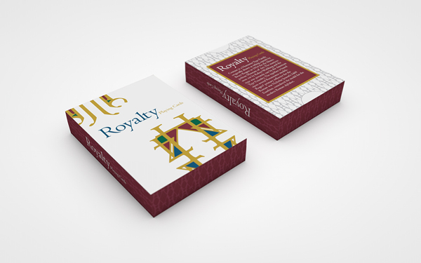
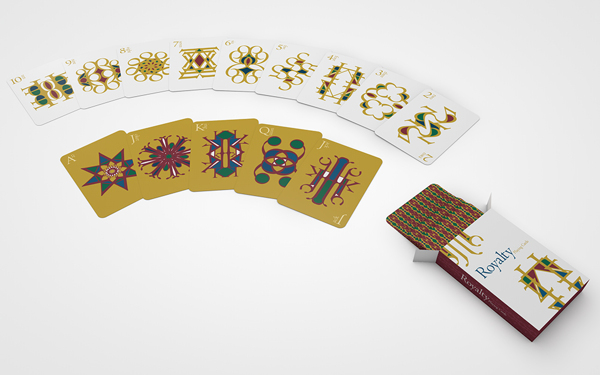
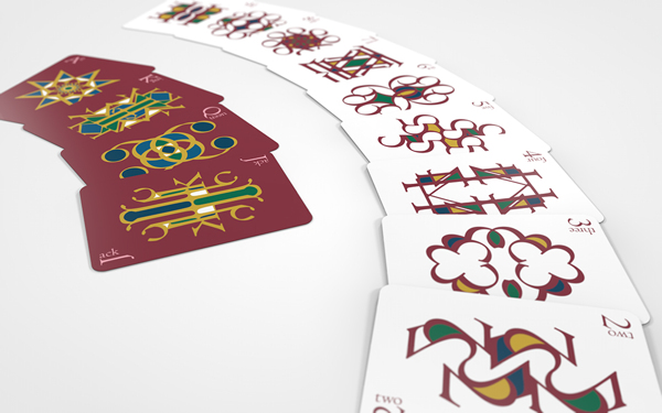
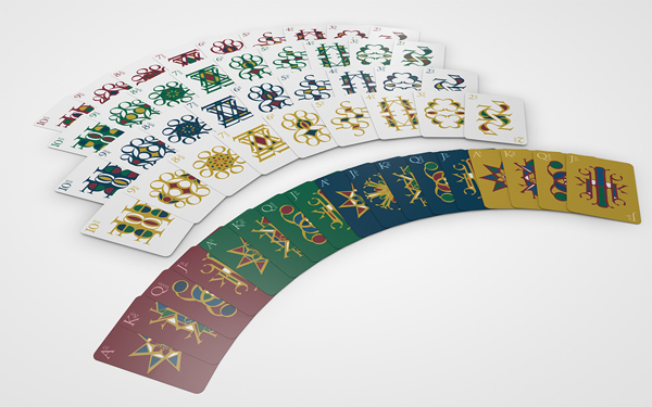
Royalty Typographic playing cards are designed by Chris Finn. The main challenge of this project was to create a visual system that provides consistency through the whole set of cards. They are a consistent and solid group because they share visual features that unite them. The theme of the deck based on the design of the typeface (Centaur) is “Royalty”. Chris chose the colors Ruby, Emerald, Sapphire and Gold to represent the jewels and metals commonly found around royalty.


♠♥♣♦♠♥♣♦♠♥♣♦♠♥♣♦♠♥♣♦♠♥♣♦♠♥♣♦♠♥♣♦♠♥♣♦♠♥♣♦♠♥♣♦♠♥♣♦♠♥♣♦♠♥♣♦♠♥♣♦♠♥♣♦♠♥♣♦♠♥♣♦♠♥♣♦♠♥♣♦♠♥♣
- See other Typographic playing cards on this blog (Category: “Typographic Playing Cards”).
- See other playing card projects on Bēhance (Category: “Bēhance”).
♠♥♣♦♠♥♣♦♠♥♣♦♠♥♣♦♠♥♣♦♠♥♣♦♠♥♣♦♠♥♣♦♠♥♣♦♠♥♣♦♠♥♣♦♠♥♣♦♠♥♣♦♠♥♣♦♠♥♣♦♠♥♣♦♠♥♣♦♠♥♣♦♠♥♣♦♠♥♣♦♠♥♣